Images on the Web: A Complete Guide to Formats, Performance, Accessibility, and SEO
Images can explain an idea, demonstrate a product, establish a visual identity, and make a long page easier to scan. They can also become some of the heaviest resources on a website. A useful image therefore has two jobs: it must support the content, and it must reach the visitor without wasting bandwidth or delaying the page.
This guide covers the complete workflow: sourcing images legally, choosing a format, exporting and compressing files, building responsive markup, preventing layout shifts, writing alternative text, configuring caching, and helping search engines and social platforms understand the result.
Start With the Image's Purpose
Before adding an image, decide what it contributes. An image may show a product, explain a process, provide evidence, help a visitor recognize a place or person, or create a deliberate mood. If removing it would not change the meaning or experience, it may be decorative. That distinction affects the file you choose, its placement, and the alternative text it needs.
Avoid putting essential copy, instructions, prices, or calls to action only inside an image. Real HTML text is easier to read, translate, resize, search, and maintain. When an infographic contains important information, summarize that information in the surrounding page or provide a transcript.
Where to Get Images
Create them yourself. Original photography, screenshots, diagrams, illustrations, and graphics made in tools such as Figma or Photoshop can match the content and brand precisely.
License them. Stock libraries offer predictable licensing terms, but the license still needs to cover the intended medium, audience, territory, and commercial use.
Commission them. A photographer, illustrator, or designer can produce distinctive material and deliver the source files and usage rights specified in a contract.
Use openly licensed or public-domain work. Search tools can help discover it, but finding an image through a search engine does not grant permission to reuse it. Verify the license on the original source, follow attribution requirements, and keep a record of the source and license.
Reverse image search is not a license check
Tools such as Google Lens and TinEye can help find an image's likely origin or earlier copies. They cannot prove ownership or guarantee that a particular use is lawful.
Remove private or unnecessary metadata before publishing. Camera files may contain a capture date, device information, or GPS coordinates in EXIF data. Keep an archival original separately if that information is valuable.
Choose the Right Image Format
No format is best for every image. Choose according to the content, transparency and animation requirements, target browsers, and the result of a real size-and-quality comparison.
JPEG
JPEG is a dependable choice for photographs and other images with continuous tones. It uses lossy compression and does not support transparency. Export quality is not a universal percentage: compare several settings at the actual display size and keep the smallest version that still looks good.
PNG
PNG uses lossless compression and supports alpha transparency. It works well for screenshots, diagrams, and graphics with sharp edges or a limited palette, but it is often much larger than a modern format for photographs.
WebP
WebP supports lossy and lossless compression, transparency, and animation. It is widely supported by modern browsers and often produces smaller photographic or transparent assets than JPEG or PNG at comparable visual quality.
AVIF
AVIF can achieve excellent compression for photographs and supports transparency and high dynamic range. Encoding may be slower, and results vary by image, so compare it with WebP rather than assuming it will always be smaller or better. A fallback may still be appropriate for the browser range required by the project.
SVG
SVG is ideal for logos, icons, charts, and illustrations that can be represented as vectors. It scales without becoming blurry and can be styled or scripted when embedded appropriately. Optimize exported markup, remove editor data, and sanitize SVG files obtained from untrusted sources because SVG can contain active content.
GIF and BMP
GIF remains useful when compatibility with a simple legacy animation is essential, but modern video or animated WebP and AVIF can be far more efficient. BMP is generally unsuitable for production web pages because it produces unnecessarily large files. Neither should be the default simply because an editing tool exported it.
Prepare and Optimize the Source File
Start from the highest-quality original available, then create derivatives for the website. Do not repeatedly edit and resave an already compressed JPEG; each generation may introduce new artifacts.
Crop for the Intended Composition
Remove pixels that will never be visible. If the same subject must work in a wide desktop banner and a narrow mobile card, create separate crops so the important part does not become tiny or disappear. This is called art direction and is different from simply resizing one image.
Export Sensible Dimensions
A 5,000-pixel-wide photograph is wasteful when its largest rendered slot is 800 pixels wide. Export enough resolution for the layout and the device densities you intend to support, but do not send the original camera file to every visitor. At the other extreme, enlarging a tiny asset makes it soft and reveals compression artifacts.
There is no universal 100 KB rule
A useful byte budget depends on the image's purpose, dimensions, visual complexity, and importance. Measure the complete page on realistic devices and networks instead of forcing every asset toward one arbitrary number.
Compress and Inspect
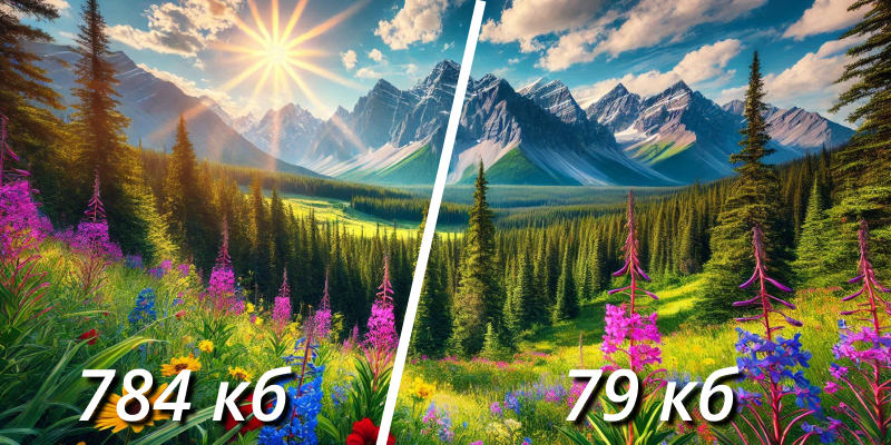
Compression removes or represents image data more efficiently. Lossy compression can reduce a file dramatically, but excessive compression creates ringing, banding, block artifacts, or unreadable text. Inspect the exported image at its intended size and, for important assets, on more than one type of screen.
Use Descriptive File Names
A file name should be stable, readable, and useful to people maintaining the site. Prefer red-shoes-summer-collection.jpg to DSC004556.jpeg. Use lowercase Latin characters, hyphens between words, and no tracking data or keyword stuffing. Descriptive names can also give search engines a small contextual clue, but the surrounding page and alternative text matter more.
Image Optimization Tools
Different tools suit different workflows. Always compare their output rather than relying on a preset alone.
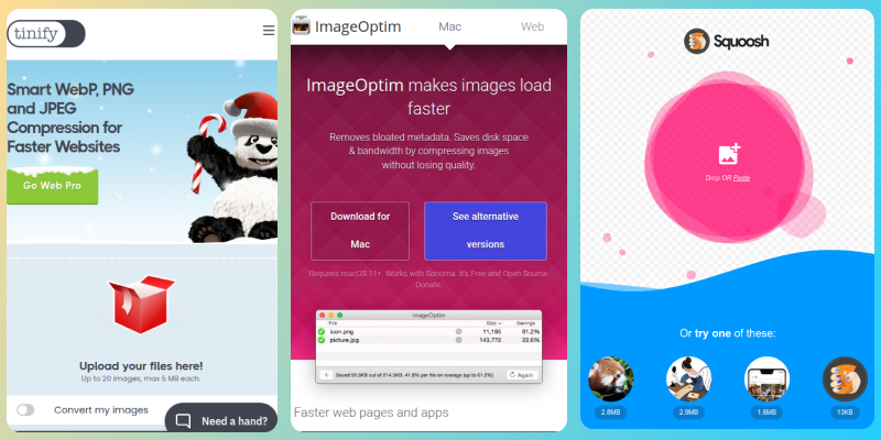
- Squoosh is a browser-based tool for comparing formats, dimensions, and compression settings visually.
- ImageOptim is a desktop application for removing metadata and optimizing image files in batches.
- TinyPNG provides straightforward lossy compression for common formats.
- Photoshop and similar editors provide controlled exports when manual art direction and retouching are part of the workflow.
- Sharp, libvips, and image CDN services can automate resizing and format generation in a build or delivery pipeline.
- CMS plugins such as ShortPixel can automate derivatives, but their output, originals, and failure behavior still need monitoring.
For a site with many uploads, automate the repetitive work: validate file types, normalize orientation, strip unwanted metadata, create several widths, generate modern formats, and record intrinsic dimensions. Keep the original outside the public delivery path so new derivatives can be created later.
Use Semantic, Accessible HTML
The img element is the foundation of an accessible and discoverable image. A solid minimal example includes a source, useful alternative text, and intrinsic dimensions:
<img
    src="red-shoes.jpg"
    alt="Red leather running shoes with white soles"
    width="1200"
    height="800"
>
Write Alternative Text for the Context
The alt attribute provides a text alternative when a visitor cannot see the image or when it fails to load. Describe the information or function the image contributes in this specific context, not every visible detail.
- For an informative image, write a concise description that communicates the relevant meaning.
- For an image used as a link or button, describe the action or destination rather than its appearance.
- For a decorative image, use an empty attribute:
alt="". This tells assistive technology to skip it. - Do not begin with “image of” unless the fact that it is a particular kind of image is important.
- Do not copy the heading mechanically, append “photo,” or fill the attribute with search keywords.
Good alternative text is written for people
It makes the page more accessible and gives search engines useful context as a consequence. Natural, specific language is better than a template built from keywords.
Do Not Depend on the Title Attribute
The optional title attribute may appear as a tooltip for some pointer users, but it is unavailable or awkward in many touch, keyboard, and assistive-technology experiences. It is not a replacement for alternative text, a visible label, or a caption. Use it only for genuinely supplementary information.
Add Captions When They Help
Put an image and its visible caption in a figure element when they form a self-contained unit. The caption may add context, credit, or interpretation; it does not need to duplicate the alternative text.
<figure>
    <img
        src="coastal-sunset.jpg"
        alt="Orange sunlight reflected across calm water"
        width="1280"
        height="853"
    >
    <figcaption>Sunset over the coast after the storm.</figcaption>
</figure>
Build Responsive Images
Responsive image markup lets the browser choose an appropriate file before it downloads the image. There are two distinct problems to solve: resolution switching, where every candidate has the same composition at a different size or density, and art direction, where the composition changes with the layout.
Resolution Switching With srcset and sizes
Use width descriptors when an image occupies different layout widths. The srcset attribute lists available files and their intrinsic widths. The sizes attribute describes how wide the slot will be under the page's media conditions. The browser combines those hints with factors such as viewport size and pixel density to select a candidate.
<img
    src="product-800.jpg"
    srcset="product-480.jpg 480w,
            product-800.jpg 800w,
            product-1200.jpg 1200w"
    sizes="(max-width: 640px) 100vw,
           (max-width: 1100px) 70vw,
           800px"
    alt="Red leather running shoes with white soles"
    width="1200"
    height="800"
>
Write sizes from the actual CSS layout, not from device categories. A source image's width is not the same as the viewport width. Browser selection is intentionally flexible, so testing should confirm that the available candidates are sensible rather than expecting one exact file in every run.
When an image always has the same CSS size but needs additional pixels on high-density displays, density descriptors can be simpler:
<img
    src="avatar.jpg"
    srcset="avatar.jpg 1x, [email protected] 2x"
    alt="Portrait of Maya Chen"
    width="160"
    height="160"
>
Formats and Art Direction With picture
The picture element allows format alternatives and media-specific sources. Put the most preferred supported format first and always finish with an img fallback; the fallback also carries the alternative text and intrinsic dimensions.
<picture>
    <source
        type="image/avif"
        srcset="team-640.avif 640w, team-1280.avif 1280w"
        sizes="(max-width: 700px) 100vw, 900px"
    >
    <source
        type="image/webp"
        srcset="team-640.webp 640w, team-1280.webp 1280w"
        sizes="(max-width: 700px) 100vw, 900px"
    >
    <img
        src="team-1280.jpg"
        alt="The studio team gathered around a worktable"
        width="1280"
        height="720"
    >
</picture>
To art-direct an image, add media conditions and provide crops that preserve the subject at each layout. Do not use art direction merely to duplicate breakpoints; use it when the content of the crop genuinely needs to change.
<picture>
    <source media="(max-width: 640px)" srcset="chef-portrait.jpg">
    <source media="(min-width: 641px)" srcset="chef-kitchen-wide.jpg">
    <img
        src="chef-kitchen-wide.jpg"
        alt="Chef Amara plating a dish in the restaurant kitchen"
        width="1440"
        height="810"
    >
</picture>
Prevent Layout Shifts
Include width and height on images. These attributes communicate the intrinsic aspect ratio, allowing the browser to reserve space before the file arrives. CSS can still make the image fluid:
img {
    max-width: 100%;
    height: auto;
}
The attributes should reflect the source image's real aspect ratio, not necessarily its rendered CSS size. For a deliberately cropped component, reserve the required space with CSS aspect-ratio and control the crop with object-fit.
Load Images at the Right Time
Lazy-Load Offscreen Images
Native lazy loading delays images that are far enough outside the viewport, reducing initial network and decoding work. Use it for ordinary below-the-fold content:
<img
    src="gallery-01.jpg"
    alt="Hand-thrown ceramic bowls on a wooden shelf"
    width="1200"
    height="800"
    loading="lazy"
    decoding="async"
>
Do not lazy-load an image that is visible when the page opens, especially when it is likely to be the Largest Contentful Paint element. Its URL should be discoverable in the initial HTML. A genuinely critical image may benefit from fetchpriority="high", but use that signal sparingly and confirm the result with performance measurements.
Understand decoding
decoding="async" asks the browser to decode an image without blocking other presentation work when possible. It is a hint rather than a guarantee, and adding it to every image is not a substitute for reducing dimensions and bytes.
Cache Images Deliberately
Versioned image URLs can be cached for a long time because a changed file receives a new URL. A common response header for a content-hashed asset is:
Cache-Control: public, max-age=31536000, immutable
publicpermits storage by shared caches such as a CDN when the response is otherwise cacheable.max-age=31536000gives the response a one-year freshness lifetime.immutabletells supporting clients that the resource will not change during that lifetime.
Long-lived caching is safe only when the URL changes with the content. A build hash such as sofa.a81f3c.webp is more reliable than a manually maintained query string. For stable URLs that may change, use a shorter lifetime or revalidation with an ETag or Last-Modified header.
Use a CDN When It Solves a Real Delivery Problem
A content delivery network can reduce latency, absorb traffic spikes, and transform images close to visitors. It can help sites of many sizes; there is no meaningful visitor-count threshold. The decision depends on audience geography, origin performance, cost, cache hit rate, operational complexity, and whether on-demand resizing will simplify the image pipeline.
When images use a separate CDN hostname, keep URLs stable, allow search crawlers to access them, configure correct content types and caching, and retain control over the domain if long-term search visibility matters. Test failure behavior and avoid generating an unlimited number of transformation variants.
Image SEO
Image search optimization begins with a useful page. Place an image near relevant visible text, use a descriptive file name and alternative text, and make sure the page and image are crawlable. Search engines can understand context from the page title, heading, caption, surrounding copy, links, and structured data; repeating the same keyword in every field does not make the image more relevant.
Make Images Discoverable
- Use ordinary crawlable
imgmarkup for important content rather than exposing it only as a CSS background. - Do not block required image URLs in
robots.txt, authentication, or firewall rules. - Keep image URLs stable and return the correct HTTP status and
Content-Type. - Render lazy-loaded images without requiring a click, swipe, or other user action.
- Use an image sitemap when it helps search engines discover assets they might otherwise miss, including images inserted by JavaScript.
An image sitemap may be separate or added to a regular XML sitemap. A minimal entry associates the image URL with the page on which it appears:
<?xml version="1.0" encoding="UTF-8"?>
<urlset
    xmlns="http://www.sitemaps.org/schemas/sitemap/0.9"
    xmlns:image="http://www.google.com/schemas/sitemap-image/1.1"
>
    <url>
        <loc>https://example.com/products/red-shoes</loc>
        <image:image>
            <image:loc>https://example.com/images/red-shoes.jpg</image:loc>
        </image:image>
    </url>
</urlset>
Use Structured Data Only When It Matches the Page
Structured data should describe the primary subject and visible content of the page. In many cases the most useful image property belongs to a broader type such as Article, Product, or Recipe. ImageObject can provide additional image details, including creator, credit, copyright, or licensing information when those properties are applicable.
{
    "@context": "https://schema.org",
    "@type": "ImageObject",
    "contentUrl": "https://example.com/images/red-shoes.jpg",
    "caption": "Red leather running shoes from the summer collection",
    "creditText": "Example Studio",
    "copyrightNotice": "Example Brand"
}
Valid structured data makes information machine-readable; it does not guarantee a rich result, a particular ranking, or inclusion in image search.
Images for Social Sharing
Open Graph metadata lets many social and messaging platforms build a richer link preview. Provide an absolute image URL, a concise page title and description, and an image large enough for the intended card. Where appropriate, include the dimensions and an accessible description.

<meta property="og:title" content="Images on the Web">
<meta property="og:description" content="A practical guide to accessible, fast, and discoverable images.">
<meta property="og:type" content="article">
<meta property="og:url" content="https://example.com/guides/web-images">
<meta property="og:image" content="https://example.com/images/web-images-cover.jpg">
<meta property="og:image:width" content="1200">
<meta property="og:image:height" content="630">
<meta property="og:image:alt" content="A browser displaying a responsive image layout">
X Cards, historically called Twitter Cards, add platform-specific card hints. Platforms may cache previews and apply their own crop, so validate important pages with the platform tools available at publication time.
<meta name="twitter:card" content="summary_large_image">
<meta name="twitter:title" content="Images on the Web">
<meta name="twitter:description" content="A practical guide to accessible, fast, and discoverable images.">
<meta name="twitter:image" content="https://example.com/images/web-images-cover.jpg">
<meta name="twitter:image:alt" content="A browser displaying a responsive image layout">
A Practical Publishing Checklist
alt="".width and height reserve the correct aspect ratio.Image optimization is not a single export setting. It is a chain of decisions connecting editorial value, licensing, responsive design, accessibility, browser behavior, delivery, and search. When each image earns its place and the markup gives browsers enough information to load it efficiently, the page becomes faster and more useful without sacrificing visual quality.